Color Palette
Color Palette
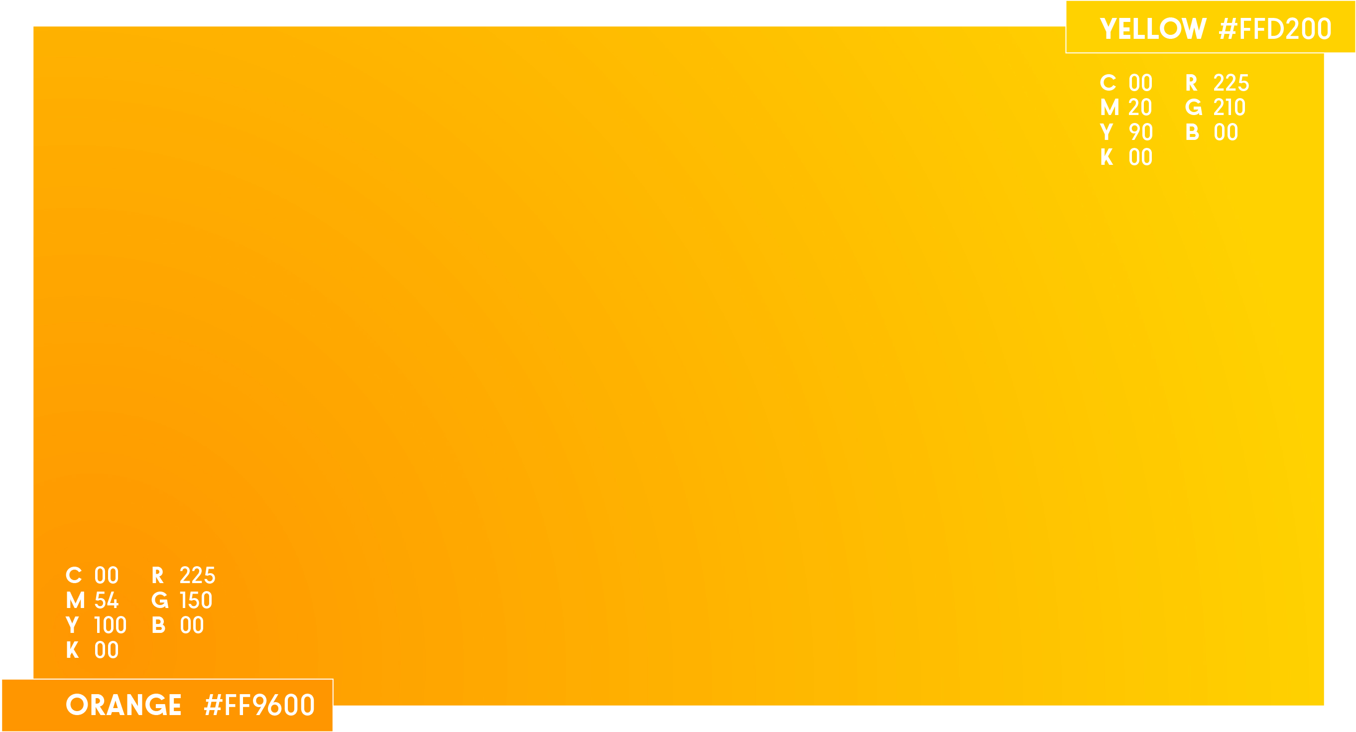
The YELLOW---ORANGE Gradient
The main corporate color of the new io.suite brand is actually a gradient between Orange and Yellow colors. It is the main color for the logo when placed on white background, and is usually the background color for io.suite white logo.
Dealing with Gradient
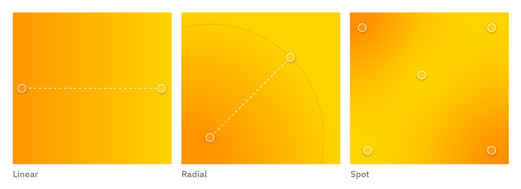
The io.suite gradient can be applied in different ways; It could be produced with the basic linear or radial gradients for simple designs that requires filling backgrounds.
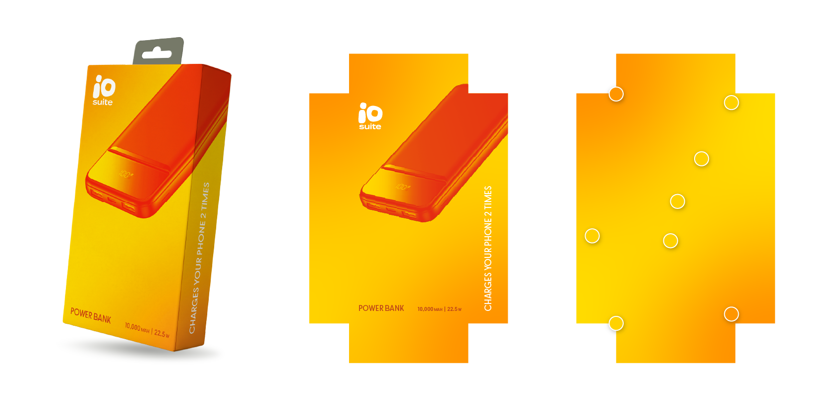
For packaging however, we use the more complex spot gradient, which is a custom gradient that allow you to move the location and volume of color spots on the shape.
An example of spot gradient for an io.suite package is demonstrated here..
The goal of using spot gradient is to have the flexibility to relocate color spots on the package in order to reach the best contrast for:
- The logo: Better to place it on an orange area.
- The filtered product image: Better to have a yellow spots behind it.
An Extra Darker Shade
This deep orange shade have been inspired by our trade mark filtered product image. It has been chosen as a color for its smooth contrast with the Yellow-Orange gradient. Mainly used for writing on the front of the package, in addition to technical uses for other promotional designed items.

Concrete Gray Shades
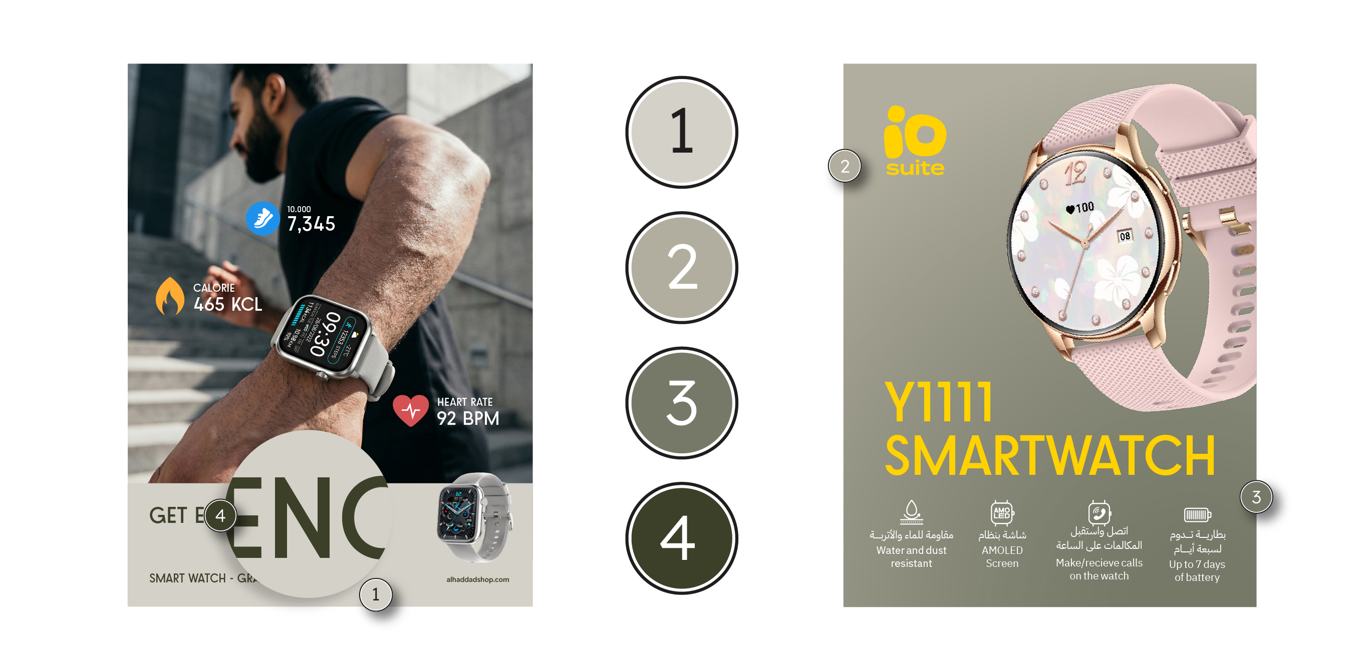
This palette of grays was created to balance the strong Orange-Yellow gradient color. With four shades covering the entire brightness scale, this concrete-gray palette offers multiple usages for io.suite visual identity.
The lighter shades is mostly used for backgrounds, and for other technical uses, while the darkest shade was added to use as the color for body text elements instead of black color.
Examples
of the different usages of the Concrete Gray shades.
Complementary Colors
The primary and secondary colors of the io.suite brand work seamlessly together to create a bold and recognizable visual identity. To provide greater flexibility and visual richness, two complementary colors have been introduced to extend the palette beyond the signature yellow-orange gradient. These colors are used selectively across photography, graphics, illustrations, and digital applications to create contrast, distinguish content, and add depth to the brand while maintaining a cohesive visual language.
The main purpose of introducing these complementary colors is to balance the richness of our Yellow-Orange color. Therefore, complementary colors can be used in variant applications such as the retail and online marketing applications.
Gradient Incorporations
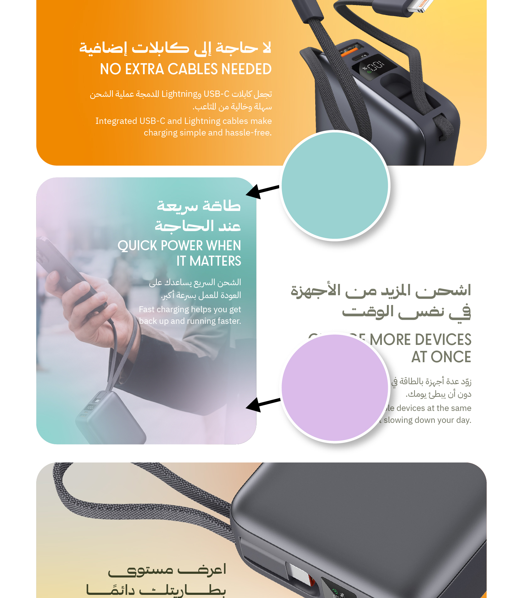
The complementary colors can also be used within costume gradients for more design flexibility, as they can be used as backgrounds when the main colors are heavily present.

Costume Backgrounds
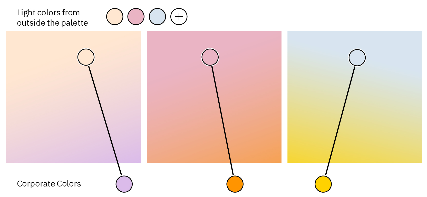
Costume Background is a gradient that consist of colors from outside the palette in addition to shades of yellow, orange or even a complementary color.
Remember to always use a corporate color (Yellow/Orange/Purple/Tiel) within the gradient, while keeping the general feel of it "light" and "soft" in order not to have a heavy color in the background.
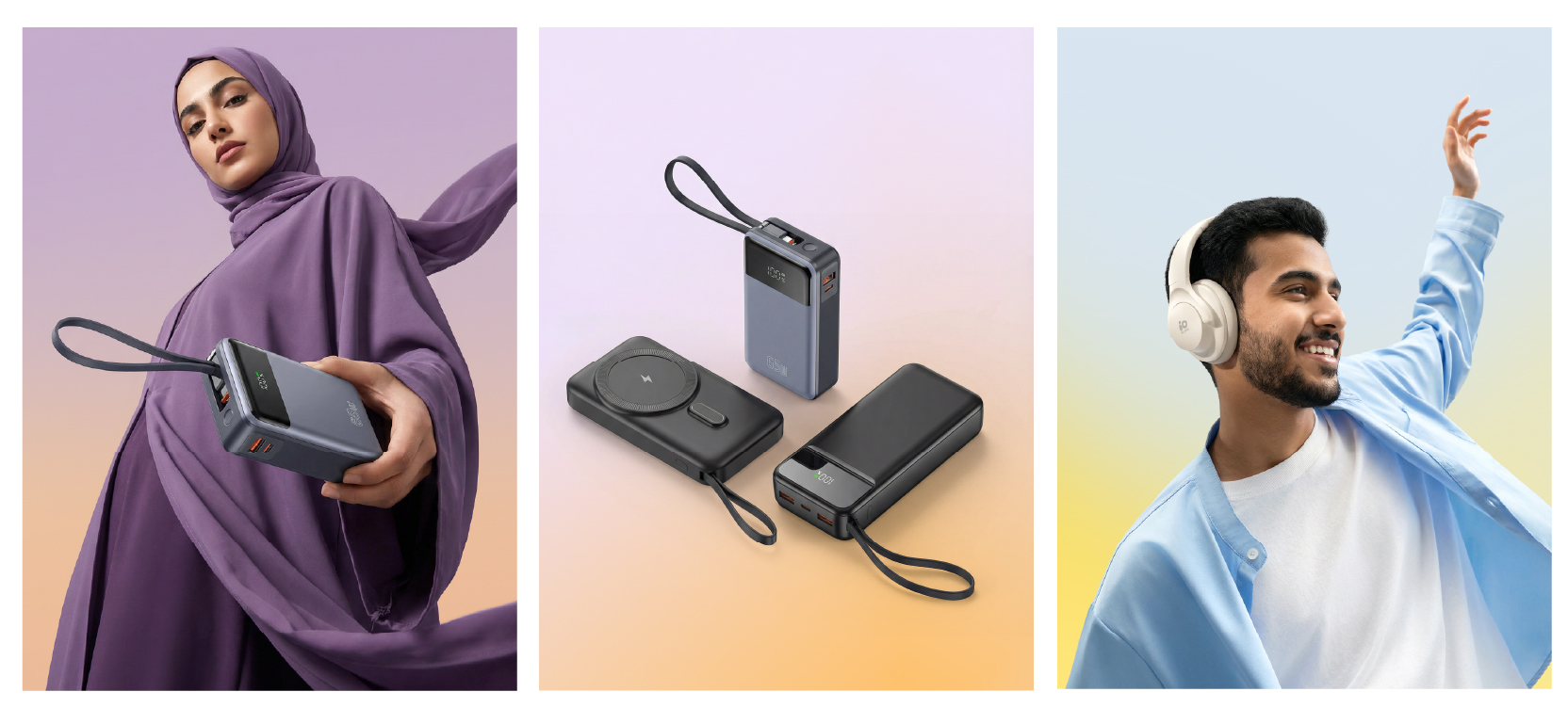
Costume Backgrounds are commonly used behind lifestyle image that is related to a special occasion, or a specific campaign, or even to match the colors of the image itself.
To the left are some examples of how to apply costume backgrounds.
Color Climate
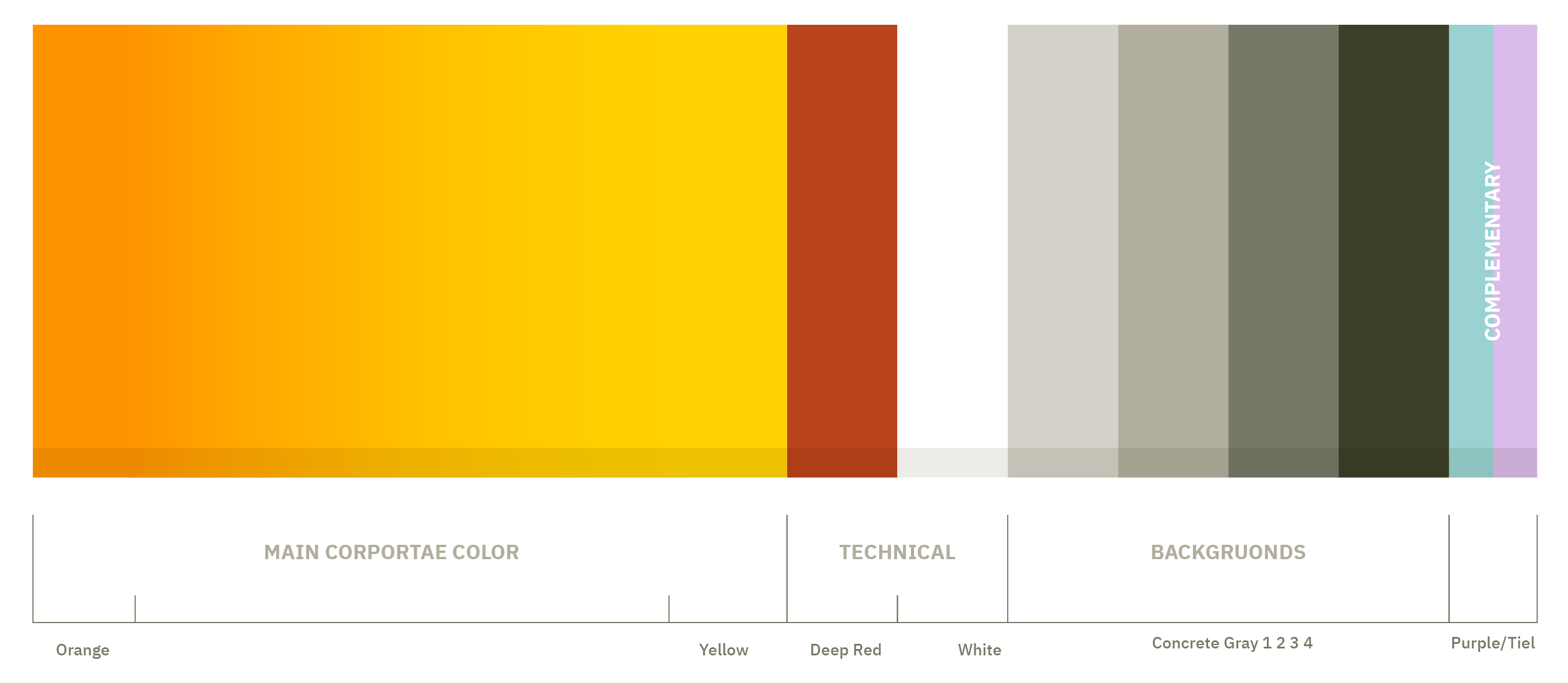
This chart demonstrates the use of the main color palette; with the Yellow--Orange gradient dominating the chart as the main corporate color. Added to it the concrete gray shades (4) that work as backgrounds to contrast the strong Yellow and Orange.
While the Deep Red and White colors are dedicated for technical uses.
There is also the complementary colors of Tiel and Purple, they add another emotional dimension to the marketing related materials and social media.
The area of each color in the bellow chart represents the usage percentage of the color compared to the remaining colors. This means Yellow-Orange gradient is dominating a design compared to the technical and complementary colors.
Color Misuse
In io.suite brand we have numerous colors, and matching them isn't an easy task, because marrying some colors within the palette won't produce the best results all the time. Bellow are some of the common matching mistakes that you have to avoid when designing for io.suite.
Do not use concrete gray elements over a Yellow-Orange background
Do not use elements of complementary colors over a Yellow-Orange background
Do not place Orange objects over concrete gray backgrounds



Do not use the deep red color as a background
Do not use the Yellow color as a background
Do not use the Orange color as a background