Packaging Design and Communication
Packaging Design
A clear and friendly packaging approach
The packaging design reflects io.suite’s positioning as a friendly, approachable brand with no technical jargon.
Visually, the system is built around the yellow-orange gradient and a distinct product image treatment, creating strong shelf presence and differentiation from typical tech packaging.
Product information, features, and benefits are written in simple language that users can easily understand, and arranged in a clean, structured way.
Each product includes a clear communication message that highlights its main function or key benefit, helping users quickly filter and choose.
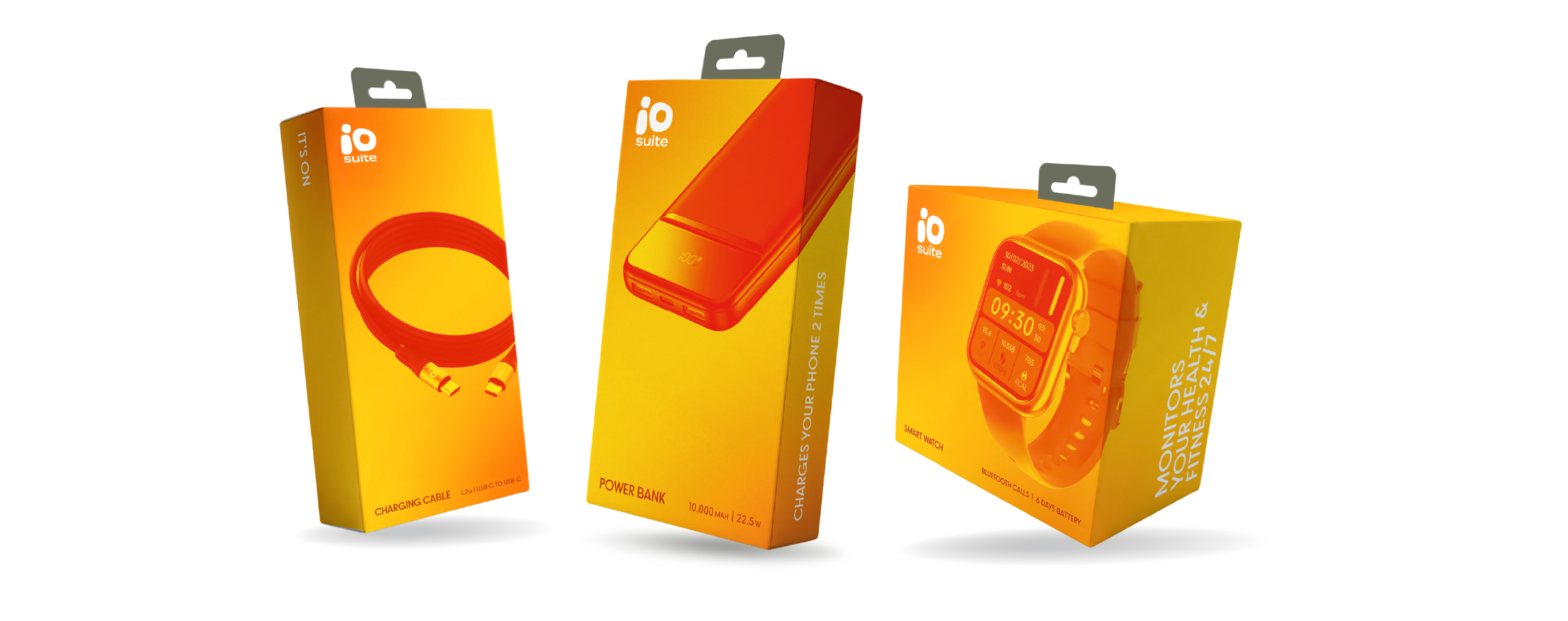
A unified packaging system
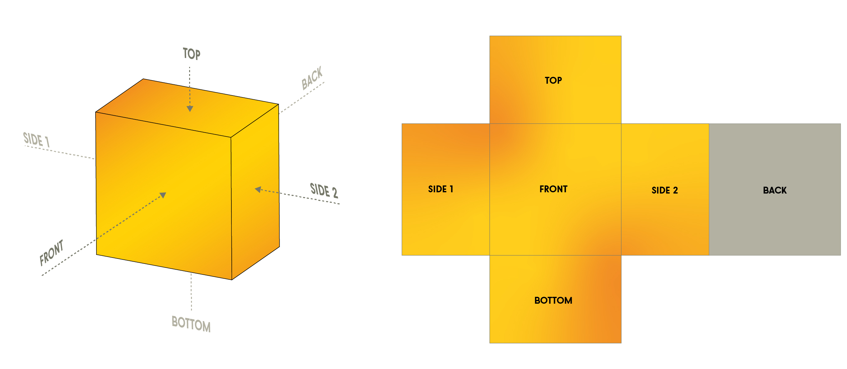
The product range follows a unified structure, where each side of the package has a defined role and consistent layout.
This creates a system that can be easily applied across different products.
Each package should be considered individually, adapting the content and layout based on the product, while staying within the overall system.
The goal is to guide users from quick understanding to more detailed information in a clear and consistent way.
Package Sides
Each side of the packaging has a clear role, guiding the user from quick recognition to detailed product information.
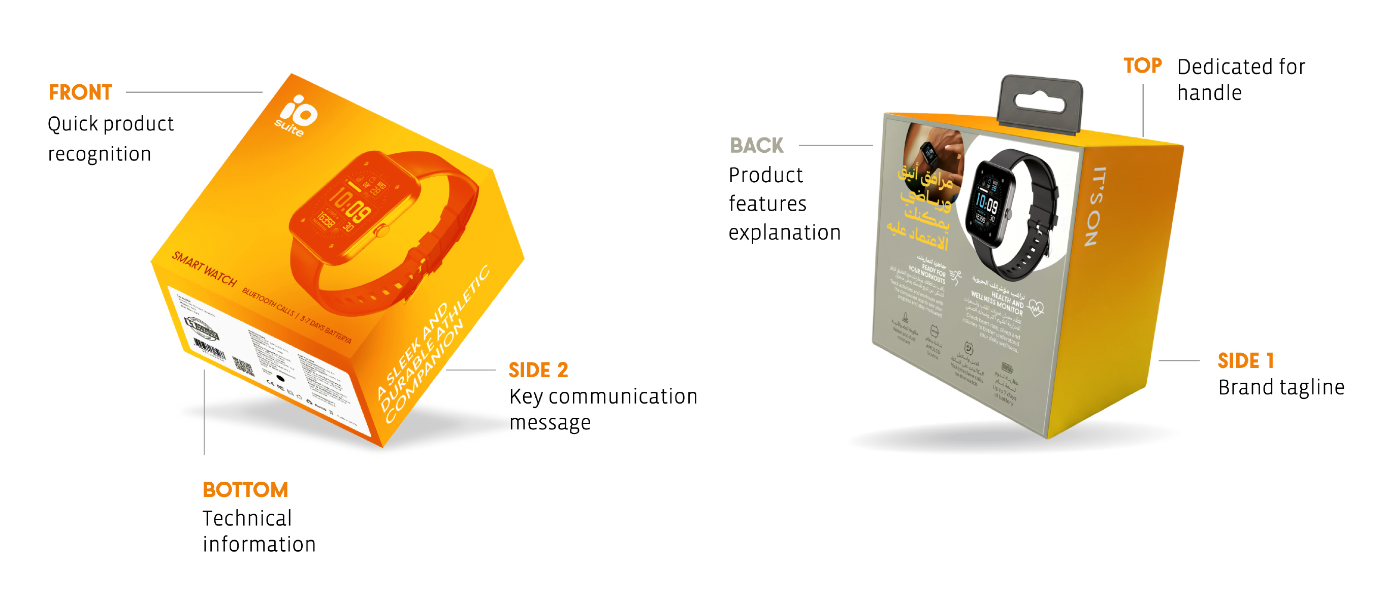
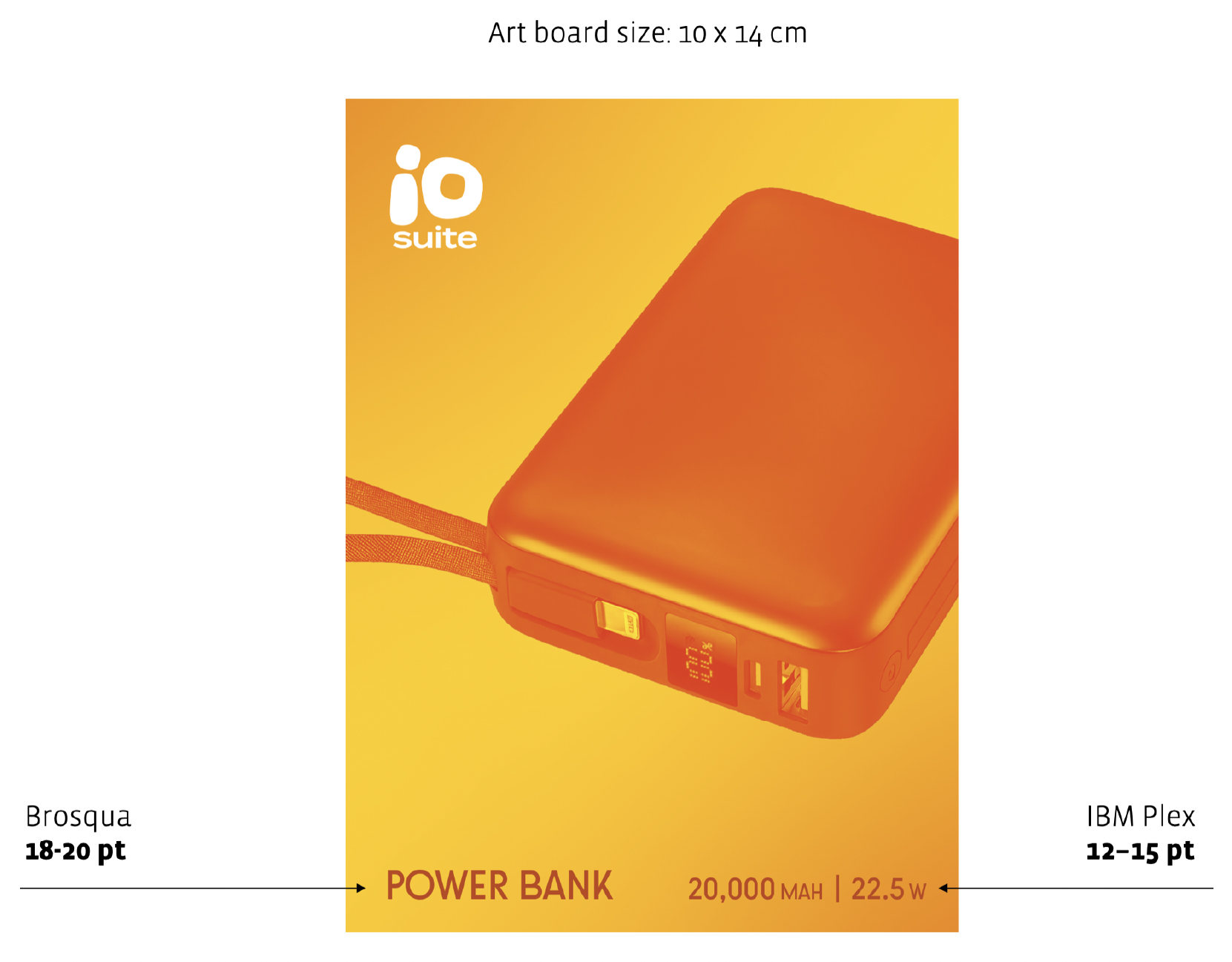
FRONT
Quick Product Recognition
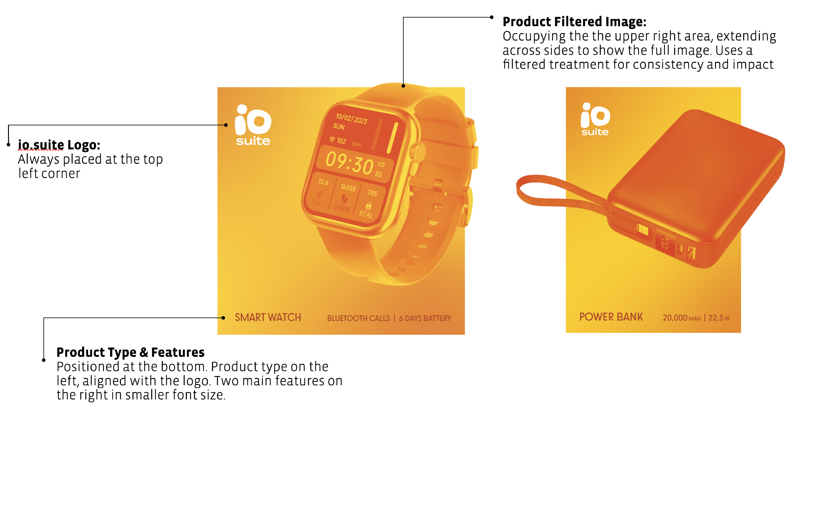
The front is designed for quick identification and understanding.
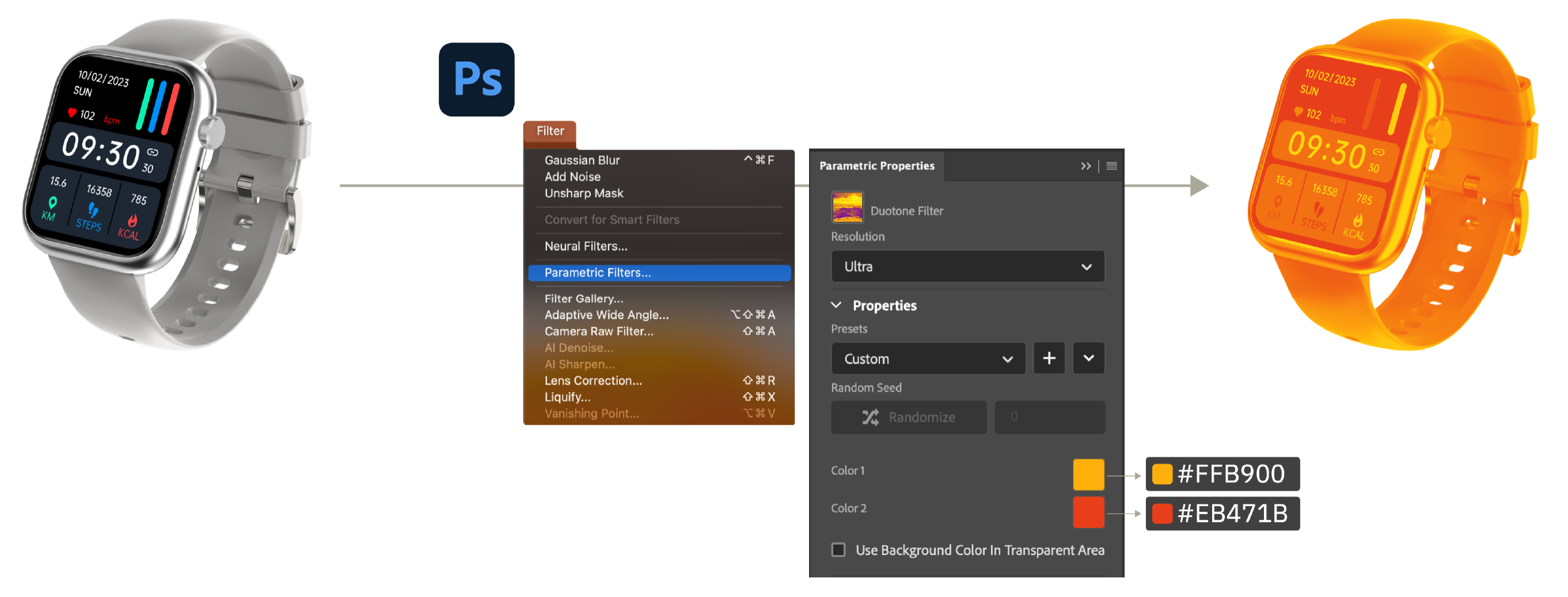
Filtered Image Creation
Producing the best filtered product image for a package front might requires some work on Photoshop. The Duotone parametric filter gives the the image its yellow-orange look.
However, that might not be enough; the image original image might require some shading adjustments (as each image is colored differently) in order to maintain a consistent look.
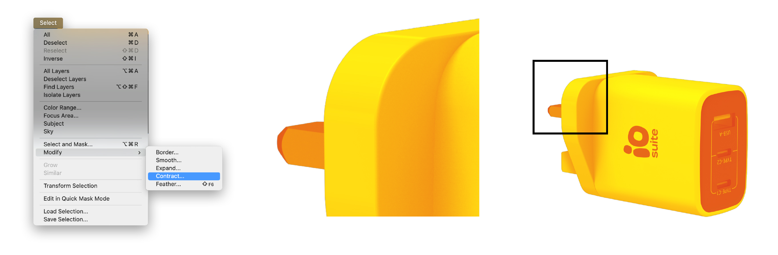
WARNING After applying the filter on the product image, a thin black line might appear on the edges of the image, it should be removed. That can be achieved manually by modifying (contract) the selection of the image (by 1 - 2 px) in order to reverse selection and deleting the frame.
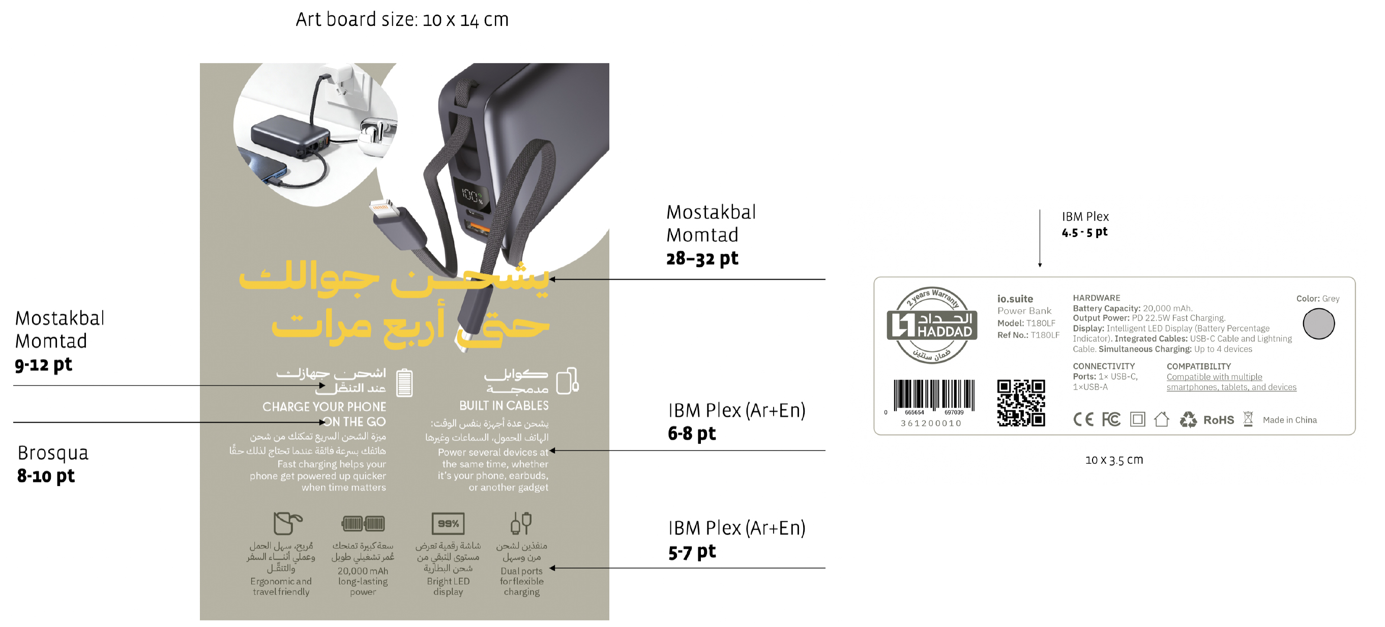
BACK
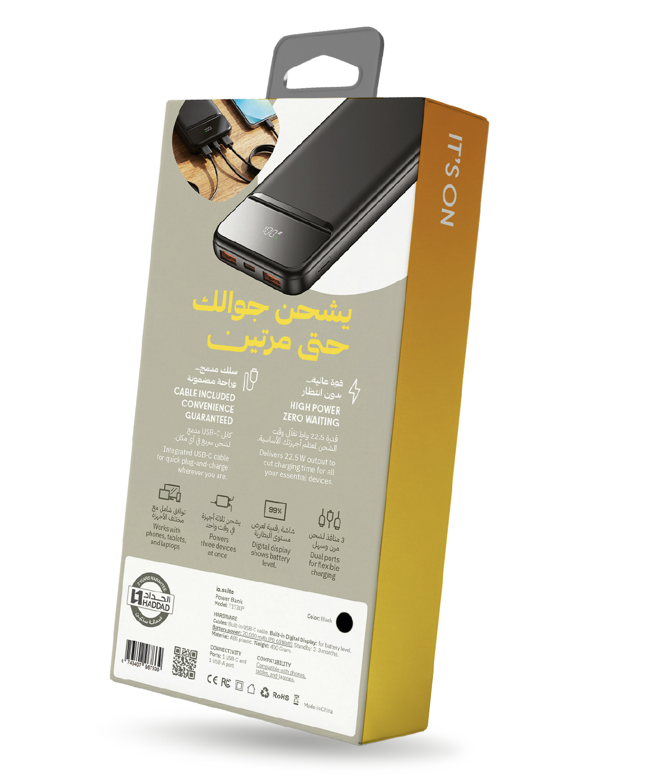
Product Features Explanation
The back provides a fuller understanding of the product.
SIDE 1
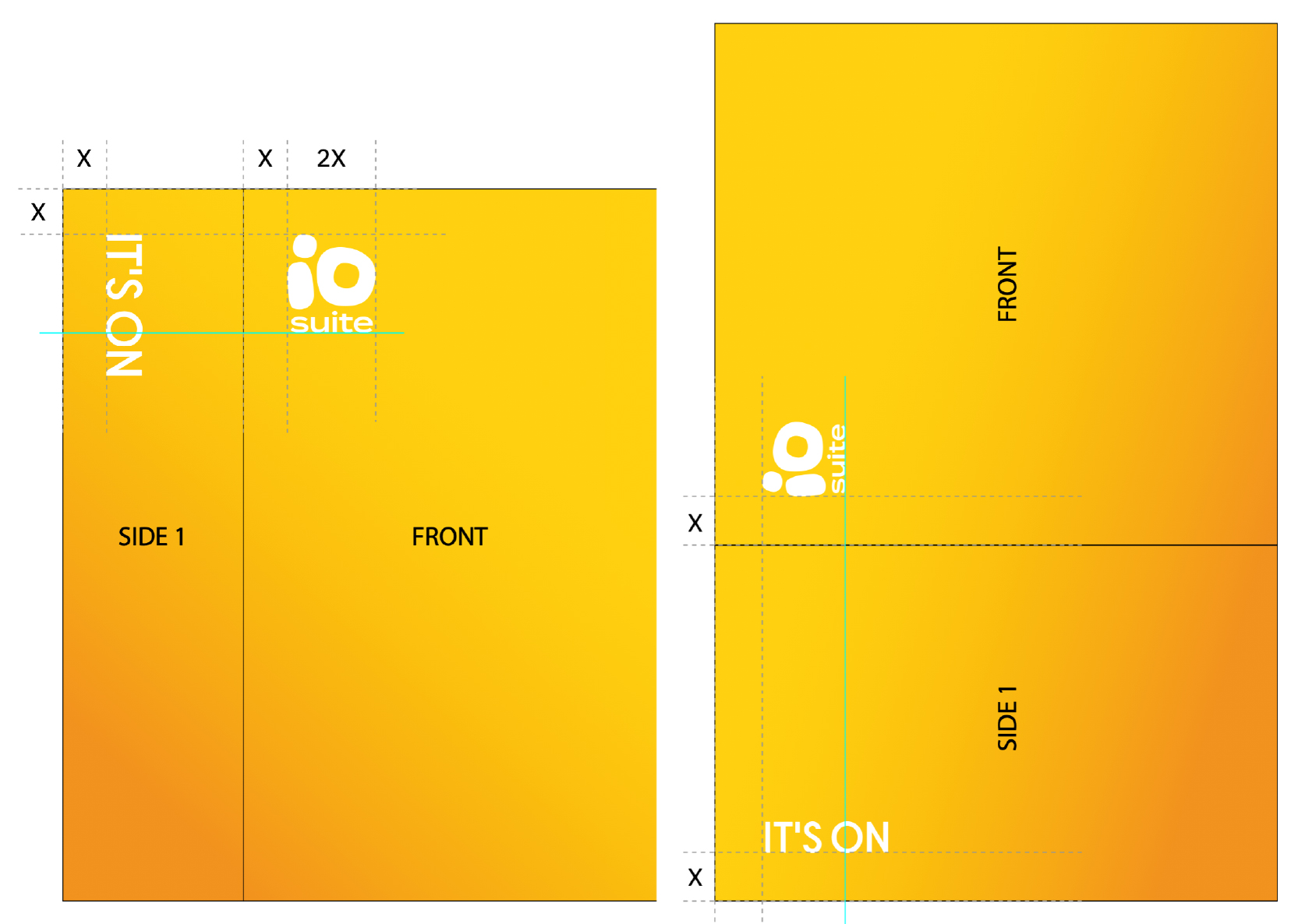
Brand Tagline
This side is dedicated to the tagline
“IT’S ON”
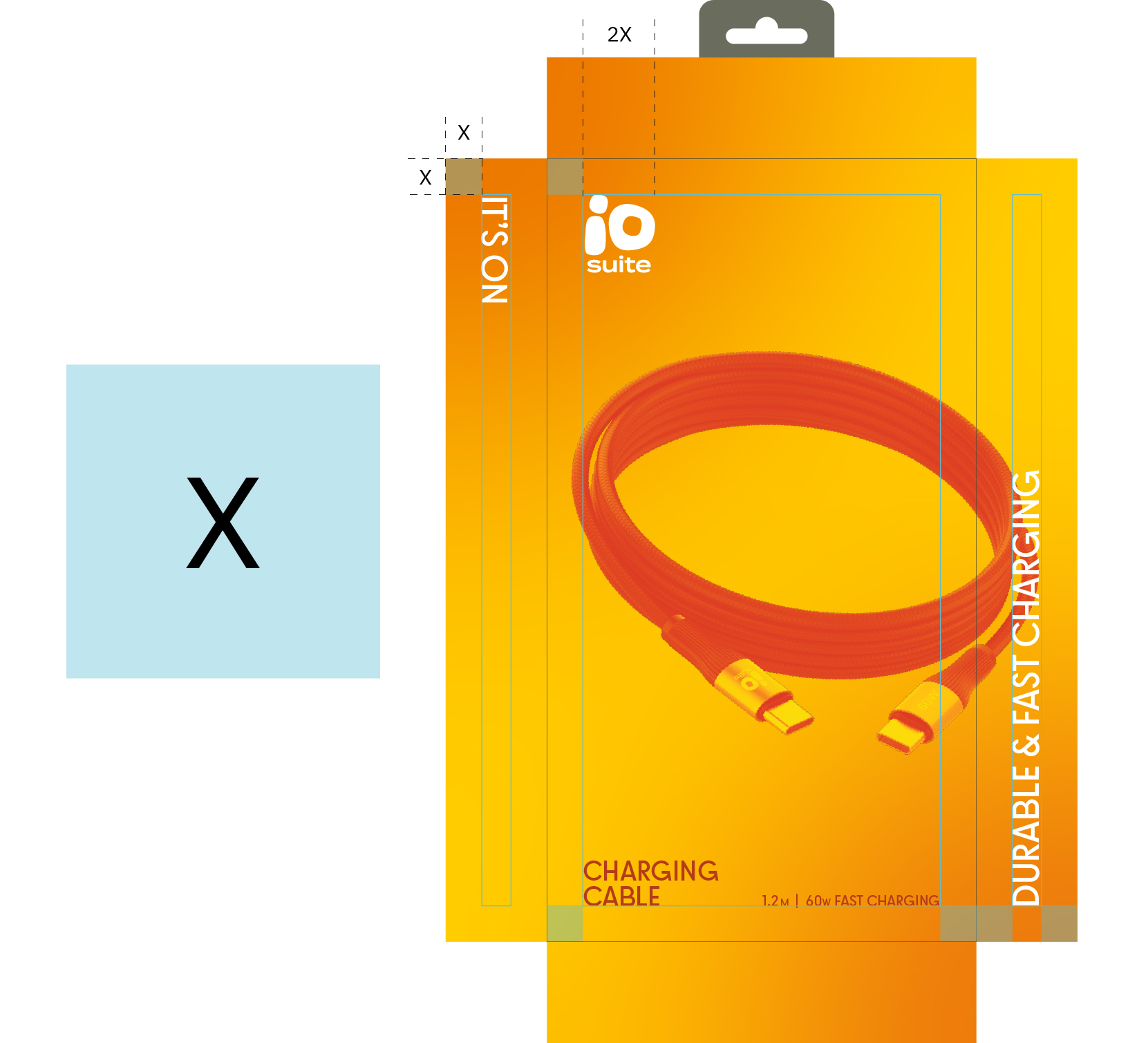
The tagline is placed vertically from top to bottom, in the opposite direction of the logo.
It follows the same margins (half width of logo) as the logo and is always slightly taller in proportion.
This side remains clean, with minimal elements.
SIDE 2
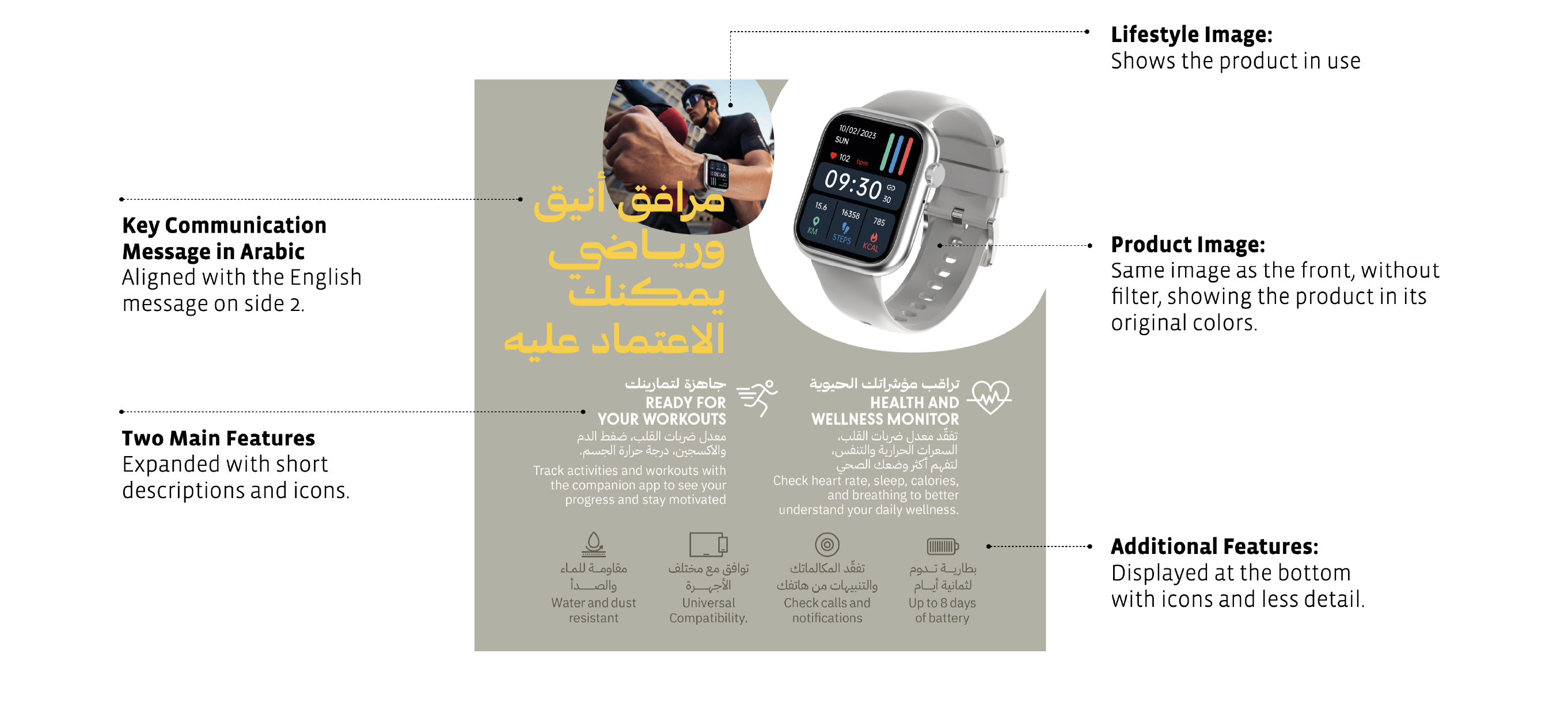
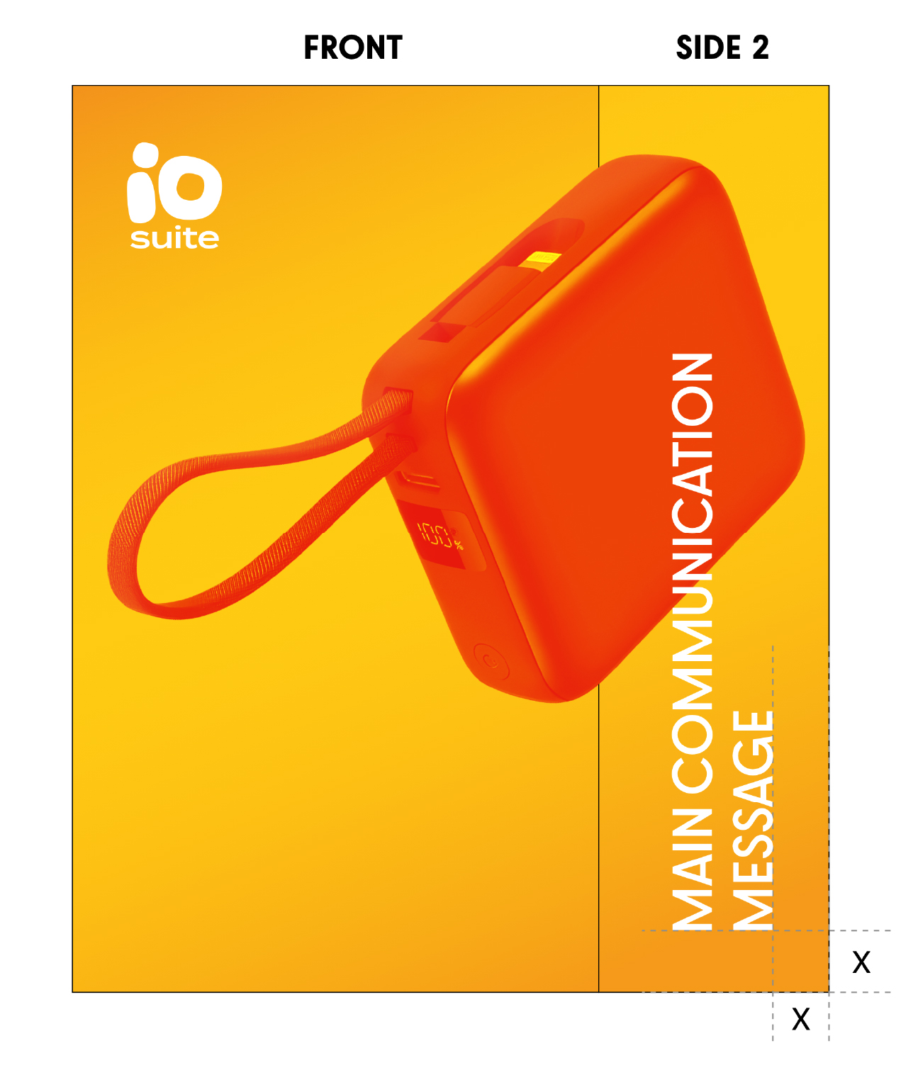
Product Key Communication Message
This side is dedicated to the main product message
This side communicates the key benefit or differentiation of this product in a simple, non-technical way.
The message is placed vertically from bottom to top, and may overlap with the product image.
BOTTOM
Technical Information
All technical details are grouped in a white information box.
The information include; technical specifications, warranty information, barcodes and shipping icons, country of origin and codes.
The layout of technical information within the box can vary, depending on the package size, while maintaining the same overall structure and grouping.
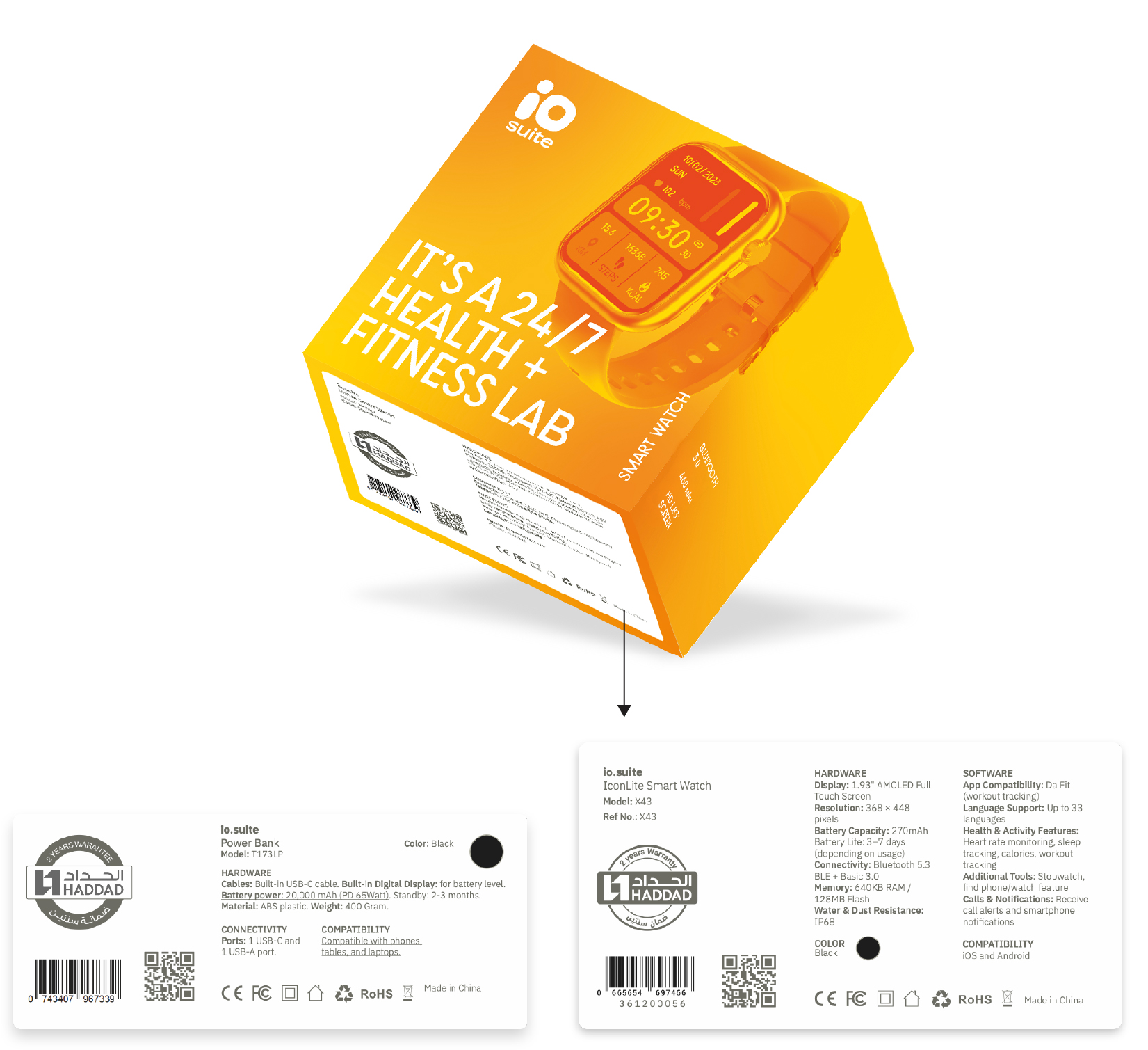
The default placement is on the bottom of the package. But if space is limited, it can be moved to the lower part of the back side.
MARGINS
The X value (half width of the logo), margin applies on the entire Front, Side 1, and Side 2. This means no text element should cross that margin.
Only The filtered image can go beyond the margin and even the side itself.
FONT SIZES
Font sizes might slightly vary between different packages depending on the size of the package.
Here we will suggest a range of sizes for each text element, and it will be up to the designer to decide on the exact font size.
These ranges applies to most of the packages (medium size), and are excluded from specific large packages (wireless headphones), and other smaller packages (ear-buds).