Logo
Logo
The new trademark
Our logo captures the essence of our identity and is the most recognizable symbol of our brand. So, it's crucial to use the logo as specified in these guidelines to make sure it always looks its best on every touchpoint.
Our new logo is a combination of: An emblem of the letters "io" drawn in an artistic fashion. In addition to the word "suite" written beneath the main emblem. The logo is a whole unite, that means it can't be broken into separate elements.
io.suite logo comes only in one lockup, no other formation is allowed.
Logo Coloring
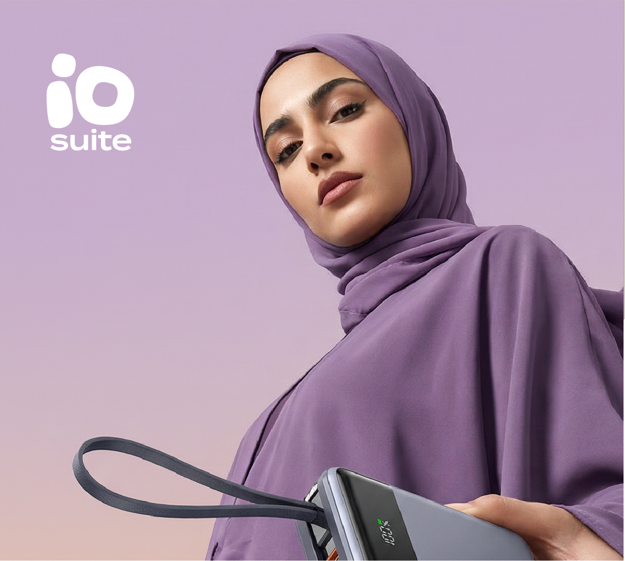
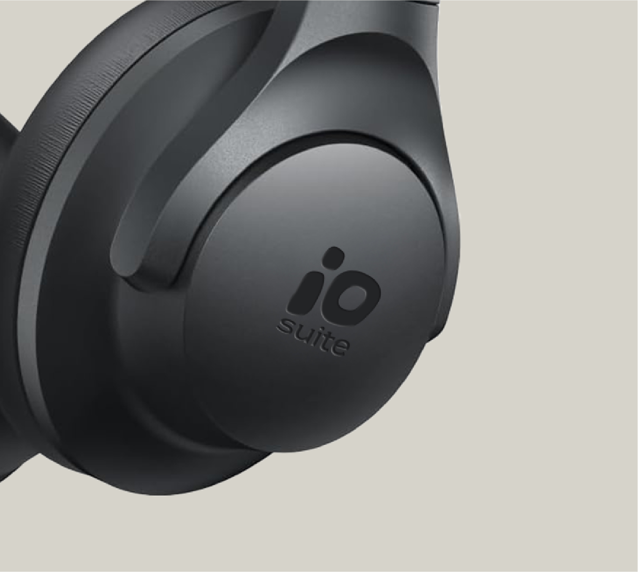
White is the most common color to use for io.suite logo, as it offers an excellent contrast with the backgrounds used in the brand, which is the case in most applications.
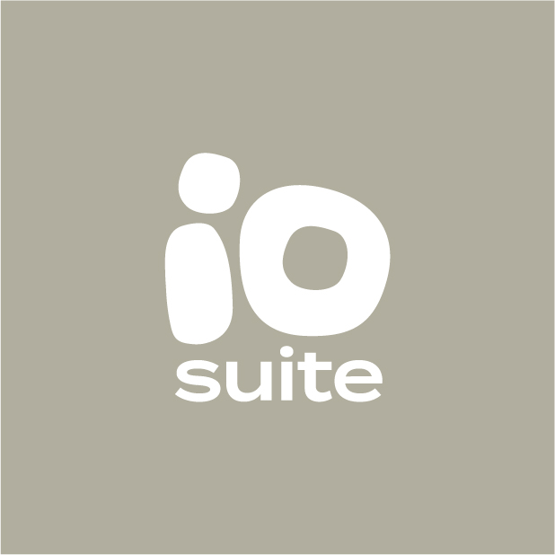
An alternative darker shade of the concrete gray color can be used for the logo when placed on a lighter background.
Also, a yellow logo is also legible only on the darker concrete gray shades as a background.
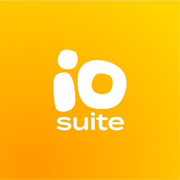
Use white logo on medium-dark image backgrounds
Use dark concrete-gray logo on light image backgrounds

Monochrome Logo
io.suite logo is a colored one by default. However, in specific cases when it is not possible to produced a colored logo, Black/White logo can be used.
It is also highly probable that producing the logo on products limits the ability to use color; printing it with Black/White is also permitted. However; Engraved logo might be the best solution in such cases so it can match the product's color.
Arabic Logo
A special Arabic version of the logo have been designed for specific cases where Arabic language is obligatory.


Exclusion Zone
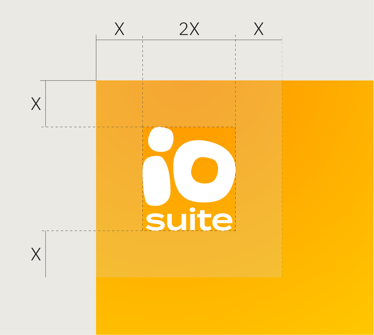
The exclusion zone is the area left around the logo before any other element. In our case it equals half the width of the logo itself. Consider this zone as the absolute minimum safe distance between the logo and any other visual element or edge. You may increase this distance but do not reduce it.
Minimum Size
Print
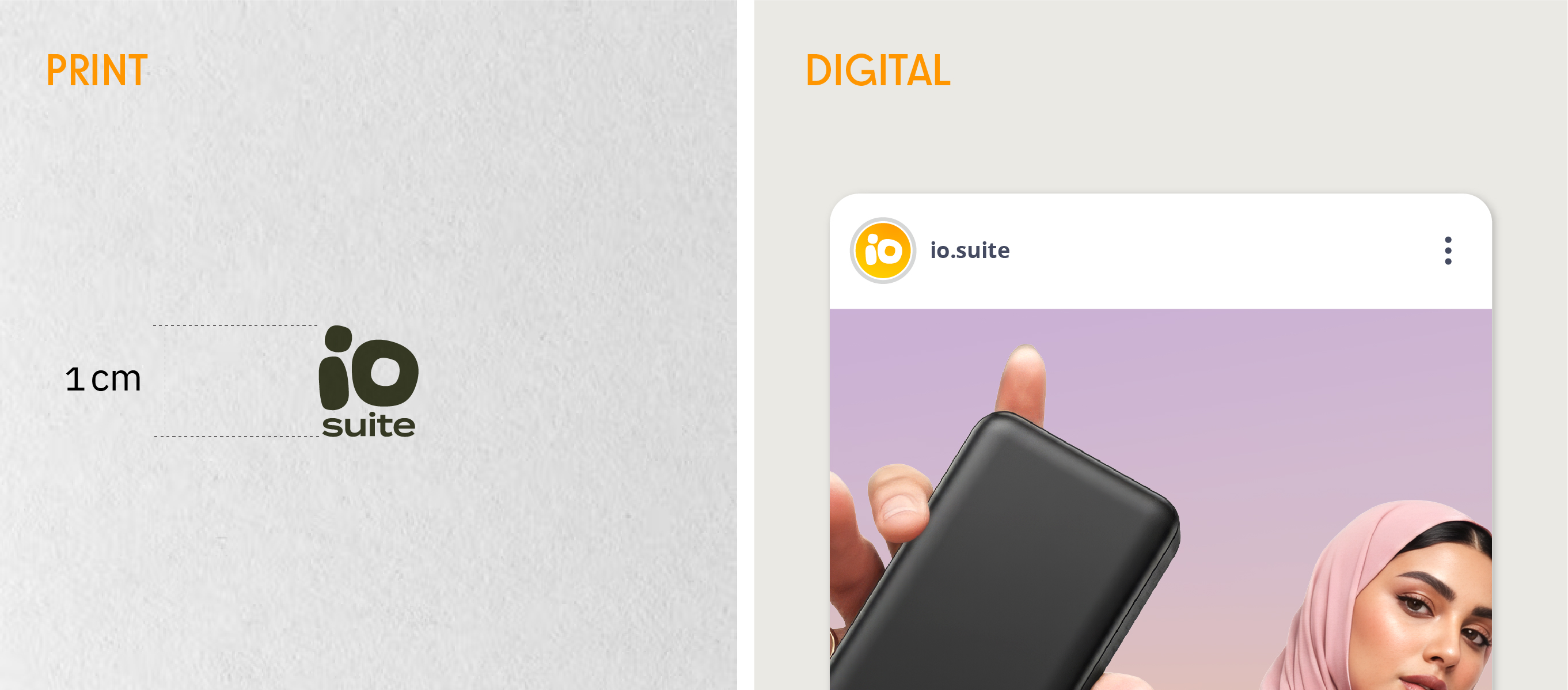
To ensure readability; No logo shall be printed if it's height is less than 1.0 cm.
Digital
The smallest size for screens an io.suite logo (in this exceptional case its the io emblem only, given that the brand name is written next to it) is probably for a social media profile picture, which is 110x110 pixels. However, to ensure the logo stays crisp and clear on high-resolution screens, it is best to upload a 320x320 pixel square image with a 1:1 aspect ratio.
Logo Misuse
io.suite logo can be considered a rigid one; As there are few variation of using it, which means lots of possible misuses. Pay attention to these common mistakes that can be carried out when applying the logo on different applications
Do not change the logo's composition
Do not add an outline to the logo
Do not add a strong shadow to the logo
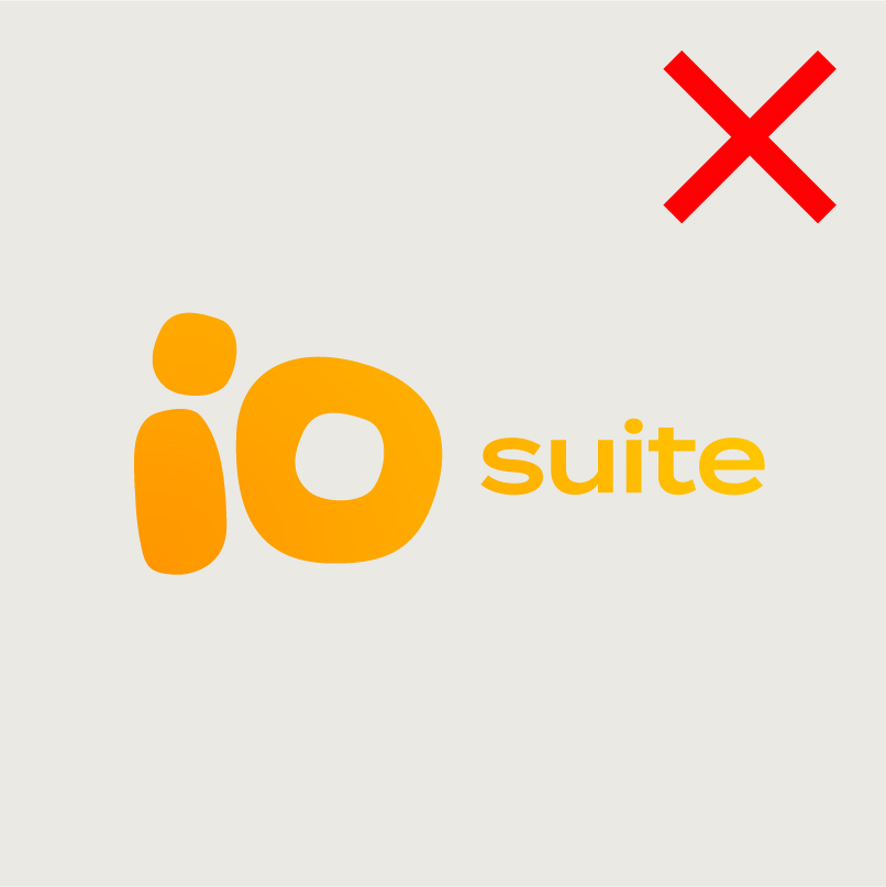
Do not stretch the logo. It should always maintain its original ratio.
Do not use the logo with a color outside the ones aforementioned, even from the primary color palette
Do not use the logo with a color outside the corporate color palette.
Logo Positioning
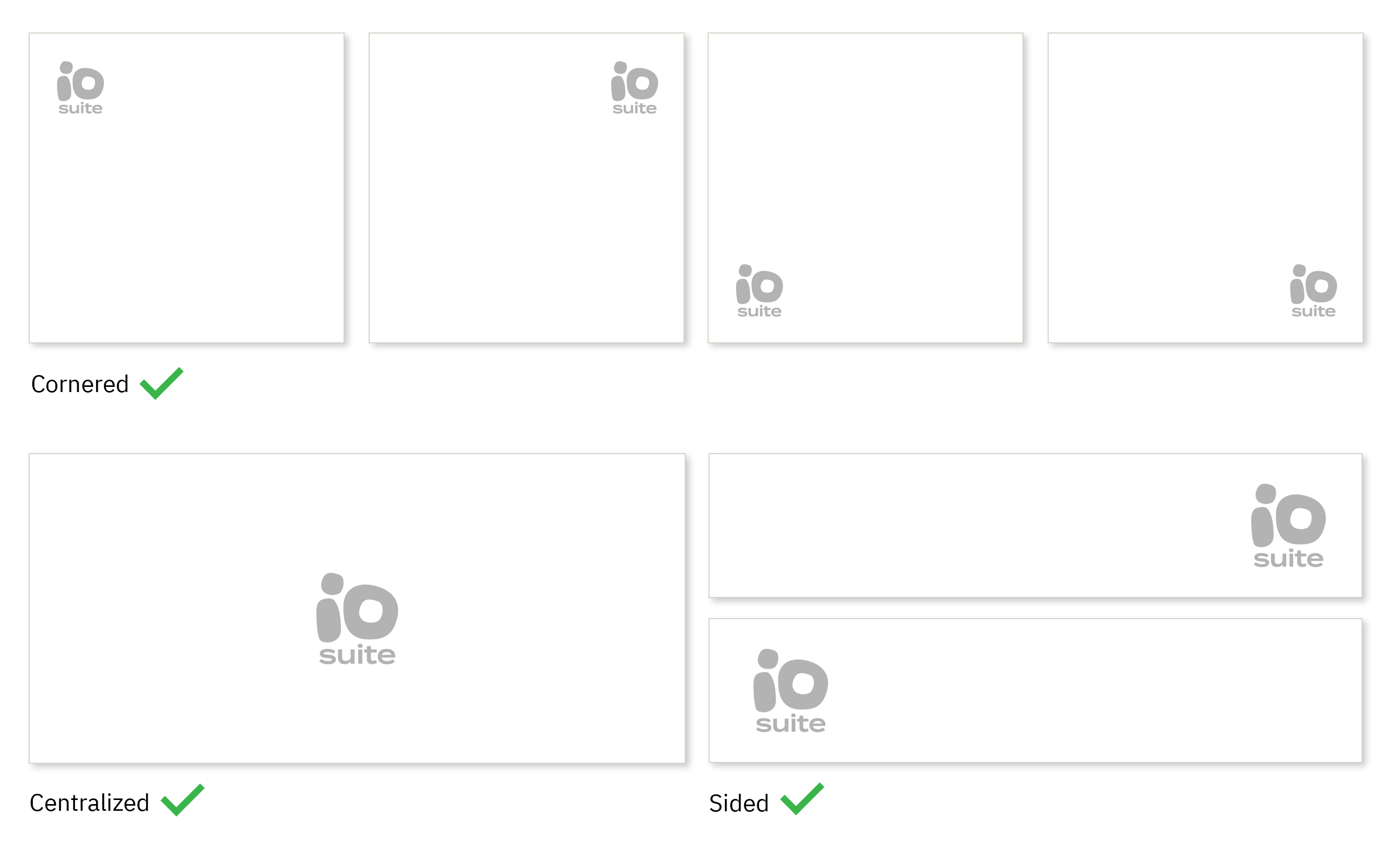
The compact formation of io.suit logo makes it easy to position it in almost every possible location, so it dose not look odd when placing it on the right or the left side of an application.
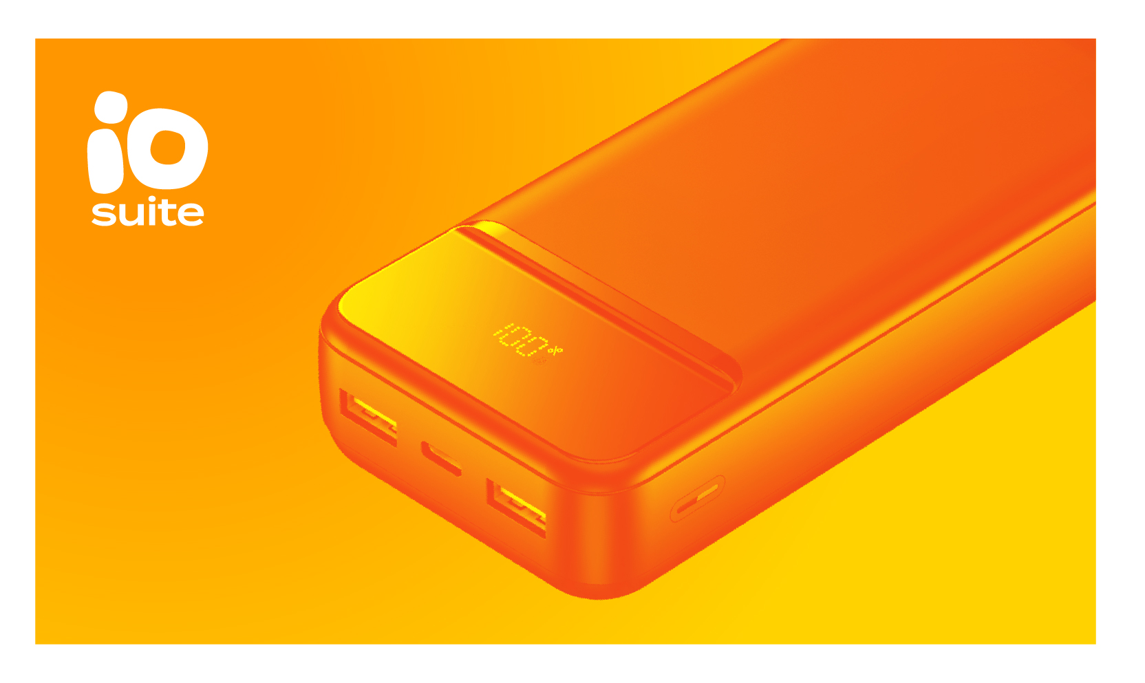
There is one exception when it comes to positioning io.suite logo, in Packaging; The logo is always placed at the top left corner in any product package.
Cobranding
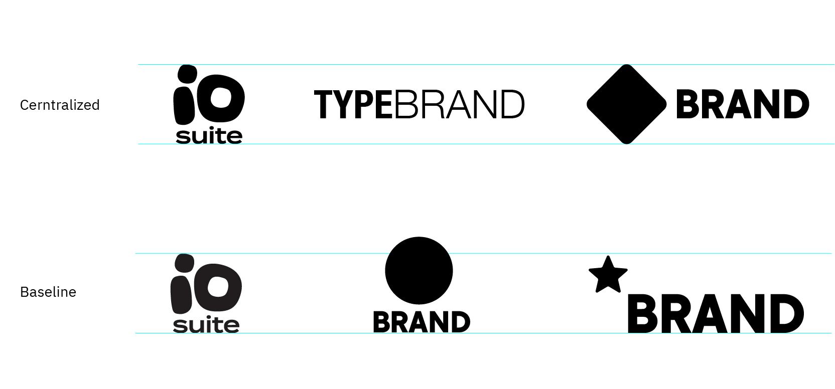
Our logo sometimes appears next to other logos. In such cases, use the most suitable alignment principle to have a balanced look.